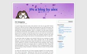
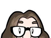
 Right, well, that was needed quicker than I’d expected. Pictured, what this blog looked like from 23 August to 9 September. All around you, then, this very website, what it looks like going forward. The centrepiece of the vibe: Still my noggin on a purple background.
There’s a bunch of things I still need to polish, give a little more shape to, but I think it’s best to just work this out live. You may in fact have caught me doing just that these past few days.
The Kubrick theme wasn’t a proper “version” of this site, it was a proof of concept, it was a way to give this the shape I needed it to have to get started. But I’ve started, I’ve got into the habit, and this is my first draft. Let’s go.
